Bitcoin on-chain metrics May 2026: MVRV, NUPL, SOPR and exchange reserves
On-chain analysis goes beyond candlesticks and volume. It observes directly what is happening on the blockchain: who is accumulating, who is distributing, where unrealized profits are concentrated. Here are the 5 most reliable Glassnode metrics to position Bitcoin within its cycle, with the latest May 2026 readings.
Where Bitcoin sits on-chain right now
Bitcoin trades around $77,000 in mid-May 2026 after pulling back from the April highs. Here are the five flagship Glassnode readings as of this week.
- MVRV Z-Score: near 1 (May 14, 2026), market is at fair value, neither euphoria nor capitulation. MVRV Ratio sits at 1.37, holders in moderate profit, room for further expansion without heavy selling pressure.
- NUPL: 0.28, Hope/Optimism zone. Above the 0.25 threshold that historically marks the transition out of fear into the early bullish phase.
- SOPR (7-day MA): 1.00, equilibrium. Holders are realizing modest profits on spent coins, but no widespread profit-taking. A sustained move above 1.02 would confirm accumulation regime ending.
- Exchange reserves: approximately 3 million BTC, a 7-year low. Continued withdrawals from exchanges signal long-term holder confidence and a structural supply squeeze.
- Realized Cap HODL Waves: long-term holder bands (1y+) still dominate the chart. Distribution from old hands has not yet started.
Reading combined: market in a recovery / early optimism phase, neither bottom nor top. Mid-cycle accumulation conditions. Sources: Glassnode, CryptoQuant, MacroMicro, AhaSignals (May 2026).
Why on-chain analysis is essential in 2026
Traditional technical analysis (candlesticks, moving averages, RSI) focuses on surface-level price and volume. On-chain analysis digs into the internal mechanics of the blockchain. It reveals the actual behavior of participants: how much BTC is in profit, how long coins have been dormant, whether holders are withdrawing or depositing on exchanges.
This data cannot be manipulated like an order book. It reflects actual movements on the blockchain, not intentions. That is what makes it particularly useful for evaluating Bitcoin macro cycles, where technical analysis alone can produce contradictory signals.
Glassnode is the reference platform for this data. Here are the 5 metrics we prioritize at Investisseur 2.0 and how to interpret them.
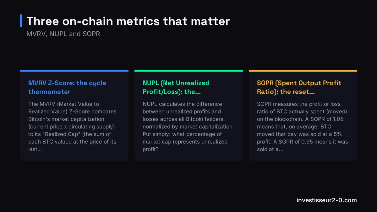
1. MVRV Z-Score: the cycle thermometer
What it measures
The MVRV (Market Value to Realized Value) Z-Score compares Bitcoin's market capitalization (current price x circulating supply) to its "Realized Cap" (the sum of each BTC valued at the price of its last on-chain transaction). The Realized Cap approximates the average acquisition cost of all existing BTC.
The Z-Score normalizes this gap in standard deviations, allowing cross-cycle comparisons despite the market's exponential growth.
How to interpret it
- Z-Score > 7: historical red zone. The market is significantly above the average acquisition cost. The tops of 2013, 2017 and 2021 all saw the MVRV Z-Score exceed this threshold. This is a zone of extreme caution, not an automatic sell signal, but a context where the probability of a major correction is high.
- Z-Score between 2 and 5: healthy expansion zone. The market is in an uptrend without excess. This is generally the longest phase of a bull market.
- Z-Score < 0.1: historical green zone. Market cap is close to or below Realized Cap, meaning the market as a whole is near breakeven or at a loss. Historically, this is the optimal long-term accumulation zone.
Limitations
The MVRV Z-Score is a macro indicator. It can remain in the red zone for weeks or even months during extended bull runs. It does not provide precise timing for short-term entries and exits. It works best as a directional filter: "Am I buying in a historically expensive or cheap zone?"
2. NUPL (Net Unrealized Profit/Loss): the market emotion map
What it measures
NUPL calculates the difference between unrealized profits and losses across all Bitcoin holders, normalized by market capitalization. Put simply: what percentage of market cap represents unrealized profit?
The 5 cycle phases
NUPL divides the Bitcoin cycle into clearly identifiable sentiment phases:
- Capitulation (NUPL < 0): the majority of the market is at an unrealized loss. Historically, these are the best long-term buying zones. Sentiment is at rock bottom, media outlets declare Bitcoin dead.
- Hope / Fear (NUPL between 0 and 0.25): the market is barely in profit. Holders are nervous, panic selling occurs at every dip.
- Optimism (NUPL between 0.25 and 0.50): confidence returns. Holders are becoming comfortably profitable. This is often the heart of the bull run.
- Belief (NUPL between 0.50 and 0.75): the market is in significant profit. Euphoria begins to build. Calls for ever-higher prices multiply.
- Euphoria / Greed (NUPL > 0.75): danger zone. Nearly the entire market is in substantial profit. Historically, cycle tops form in this zone. The temptation to "hold forever" is at its peak, and that is precisely when you should start reducing exposure.
Practical use
NUPL works as an emotional GPS for the market. When everyone is in massive profit, cascading sell-offs are statistically close. When everyone is at a loss, the selling has already happened and the floor is usually in.
3. SOPR (Spent Output Profit Ratio): the reset signal
What it measures
SOPR measures the profit or loss ratio of BTC actually spent (moved) on the blockchain. A SOPR of 1.05 means that, on average, BTC moved that day was sold at a 5% profit. A SOPR of 0.95 means it was sold at a 5% loss.
Key signals
- SOPR > 1 in a bull market: holders are selling at a profit. Normal and healthy during an uptrend. The bull market persists as long as SOPR stays mostly above 1.
- SOPR = 1 (reset): the most valuable signal. When SOPR drops back to 1 during a bull market, it means sellers are no longer profiting; they are selling at breakeven. This is often a market "reset" that precedes a new leg up. In a bear market, the same signal has the opposite interpretation: holders sell at breakeven after a bounce, signaling the resumption of the downtrend.
- SOPR < 1 for an extended period: holders are selling heavily at a loss. This is characteristic of deep bear markets and capitulation phases.
Tip: adjusted SOPR (aSOPR)
The aSOPR excludes transactions under one hour (which are often noise: internal exchange consolidations, technical transactions). It provides a cleaner signal of actual holder behavior. This is the version we prefer at Investisseur 2.0.
4. Realized Cap HODL Waves: the coin age X-ray
What it measures
HODL Waves break down Bitcoin's supply by "age": what percentage of circulating BTC has not moved in 1 day, 1 week, 1 month, 3 months, 6 months, 1 year, 2 years, 3 years, 5 years, etc. The "Realized Cap" version weights each band by its value at acquisition price, giving a view of capital locked up by holding duration.
How to read them
- Hot bands (recent coins: < 3 months): when they widen, it means a significant volume of BTC is changing hands. This is typical of market tops or phases of massive new capital inflow. "Weak hands" are accumulating; they will sell at the first serious correction.
- Cold bands (old coins: > 1 year): when they dominate, long-term holders (HODLers) refuse to sell. This is typically a medium-term bullish signal: available supply is drying up.
- The flip: the most important signal is the transition. When cold bands start shrinking and hot bands start widening, HODLers are distributing to new entrants. This is the classic cycle-top distribution process.
Why it is powerful
HODL Waves reveal a process invisible on price charts: the gradual distribution of coins from strong hands to weak hands. This process typically takes weeks to months. When it is well advanced, the market is fragile even if price continues to rise.
5. Exchange Reserves and Net Flows: the conviction flow
What it measures
Exchange reserves measure the total amount of BTC held on centralized exchange platforms. Net Flows measure the difference between inflows and outflows from an exchange over a given period.
Interpretation
- Declining reserves + negative Net Flows (net outflows): holders are withdrawing their BTC from exchanges to cold storage. This means they have no intention of selling in the near term. Less available supply on platforms = upward pressure. This is the classic bullish signal.
- Rising reserves + positive Net Flows (net inflows): holders are sending their BTC to exchanges, likely to sell. This is a signal of potential selling pressure. Particularly significant when it occurs after an extended rally.
- Sudden inflow spikes: a massive and sudden inflow to exchanges can precede a large sale (from a whale, a fund, or an exchange in distress). These events warrant heightened surveillance.
Structural trend
Since 2020, exchange reserves have been in a structural decline. This phenomenon reflects market maturation: more holders are opting for self-custody. You must therefore distinguish the structural trend (declining for years) from cyclical variations (accelerated outflows = strong conviction, reversals = selling pressure). Institutional analysis naturally complements this reading.
Reading them together: the on-chain dashboard
Each metric in isolation can produce false signals. Their power lies in convergence. Here is how we combine them in our macro reading:
Bullish configuration (accumulation / early bull)
- MVRV Z-Score < 2: the market is not yet in excess
- NUPL in "Hope" or "Optimism" zone: sentiment is not euphoric
- SOPR resetting (= 1) after a dip: sellers are exhausted
- HODL Waves: cold bands dominate (supply locked up)
- Exchange reserves declining: holders accumulating in cold storage
When these 5 signals converge, the macro bias is strongly bullish. This is when SMC long setups have the highest probability of working.
Bearish configuration (distribution / late bull)
- MVRV Z-Score > 5-7: the market is in historical excess
- NUPL in "Euphoria" zone (> 0.75): nearly everyone is in profit
- SOPR elevated and unstable: profit-taking is accelerating
- HODL Waves: hot bands widening (distribution underway)
- Exchange reserves rising: holders preparing to sell
When these signals converge, caution is warranted. Reduce position sizes, tighten stops, favor short-term trades. The 2026 cycle reading incorporates this framework.
The ambiguous case: mixed signals
In practice, all 5 metrics do not always converge. A still-moderate MVRV but HODL Waves showing early distribution, or declining reserves but NUPL already in the "Belief" zone: these divergences are common in mid-cycle.
Our rule: when signals are mixed, we reduce conviction and position size without changing directional bias. On-chain consensus only has value when it is clear. To understand how institutional liquidity interacts with these signals, see our dedicated guide.
Common mistakes with on-chain analysis
- Treating on-chain metrics as trading signals: they indicate macro context, not entries and exits. Use them as a directional filter, not as a trade trigger.
- Ignoring the lag: some metrics (HODL Waves, reserves) move slowly. A change visible today likely started weeks ago. Precise timing requires other tools.
- Over-interpreting a single metric: a high MVRV Z-Score alone does not call a top if HODL Waves and reserves do not confirm. Convergence is non-negotiable.
- Forgetting that "this time is different" sometimes happens: the arrival of spot Bitcoin ETFs has changed market structure. Exchange reserves are declining structurally because BTC is held by institutional custodians, not solely out of HODLer conviction. Historical thresholds may evolve.
Market makers and on-chain: a relationship to understand
On-chain metrics measure actual movements on the blockchain, but they do not capture everything. Market makers and institutional desks use OTC (off-chain) techniques that do not appear directly in this data. A massive BTC movement to an exchange could be an imminent sale, or an internal repositioning with no market impact.
That is why on-chain metrics work best in combination with market structure (SMC) and institutional positioning. On-chain gives the "what" (coins are moving); market structure gives the "why" (where is liquidity heading).
FAQ: Bitcoin on-chain metrics
What is the MVRV Z-Score and how do you interpret it?
The MVRV Z-Score compares Bitcoin's market value to its realized value. A Z-Score above 7 signals a historical overbought zone, while a score below 0.1 indicates an oversold zone. It is a reliable cycle thermometer, not a direct trading signal.
What is the difference between NUPL and SOPR?
NUPL measures the unrealized profits/losses of all holders (market snapshot). SOPR measures the profit/loss of BTC actually moved (real-time seller behavior). NUPL says "where is overall sentiment," SOPR says "what are the people who are acting right now doing."
Why are declining exchange reserves considered bullish?
Less BTC on exchanges = less supply available for sale. Holders withdrawing to cold storage express long-term conviction. It is a supply scarcity signal that, with constant or growing demand, supports price.
Can you use these metrics for short-term trading?
Not directly. They are macro filters. In a red MVRV zone with NUPL in euphoria, you avoid aggressive long positions. In a low MVRV zone with SOPR resetting, you look for longs. Precise timing remains the domain of market structure and SMC analysis.
Is Glassnode free?
The free tier provides access to basic versions of MVRV, NUPL and reserves with delayed data. Detailed HODL Waves and adjusted SOPR require a subscription. Free alternatives like CryptoQuant or LookIntoBitcoin offer versions of some indicators.